
Look at the five book covers above. Without studying them too much, which ones really jump out and snag your attention? Which ones are easy to pass over without a second thought? Of course, this entire subject can be debated based purely on personal preference, but one thing is a resounding common factor. It is human nature to judge a book by its cover. According to Wikipedia, the English idiom "don't judge a book by its cover" is a metaphorical phrase which means "you shouldn't prejudge the worth or value of something by its outward appearance alone". (1) Unfortunately, it has become human nature to judge EVERYTHING by the outward appearance, the first impression. 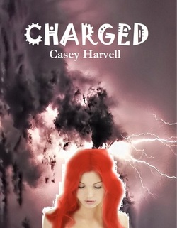 For example, the original cover of Charged by Casey Harvell was...well...made by the author due to lack of funds. Casey (bless her heart) volunteered this cover because she knew it wasn't up to par. Sometimes, authors do what they have to do in order to get their story out. Luckily, Casey was able to get some reviews of her story purely based on the story alone!
 Casey has since managed to upgrade her cover. I don't know if she's received new reviews since the change, but I believe she'll get more response with this new one.  Let's look at Hemphill Towers. Leona graciously volunteered her cover as well. I don't know who originally designed it, but I do believe they were meant to be in a professional opinion to do so. At first glance, Leona's cover isn't all that bad. The font is placed nicely and the typography is a solid fit for the design. In fact, the bottom half of the cover is great! However, the top half, the half with the three couples, is poorly constructed. Not only are all three couples muddled and degraded in terms of quality, but the crop job around them is choppy, amateur, and not even well blended. It's very possible that most common viewers wouldn't notice these things, but more often than not people are MORE critical versus the contrast (less). Nonetheless, Leona was also fortunate to receive some colorful raves.
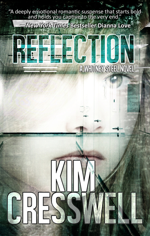
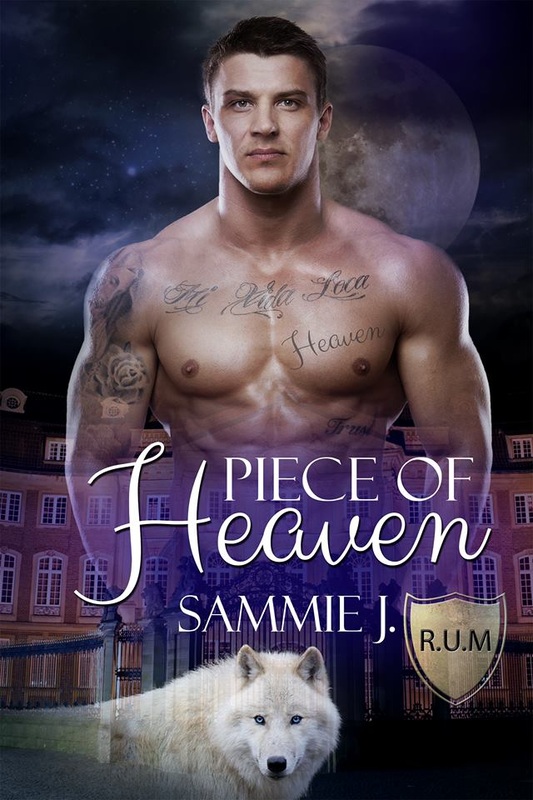
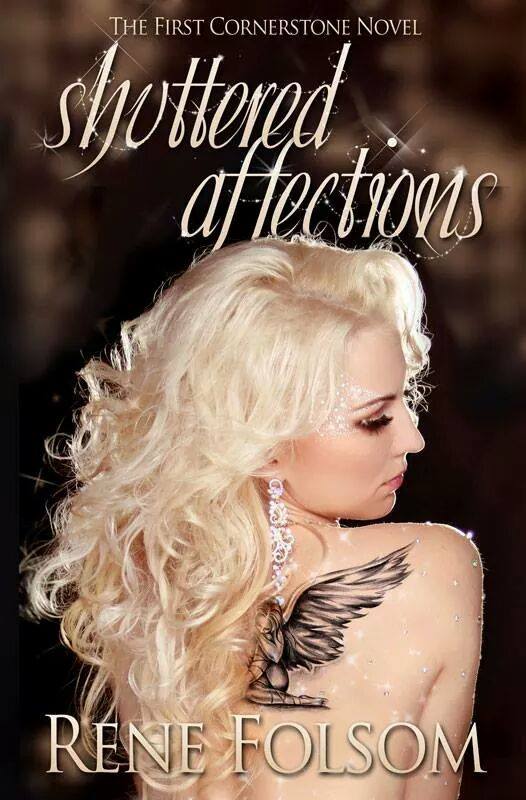
These three covers are structurally sound, and extremely appealing to the eye. The first two use sex appeal to attract the viewer, which is one of the most common techniques society has trained us with. The third uses mystery and color to pique interest. (Thank you to Rene, Sammie J., and Kim for volunteering your covers.) As a graphic designer, I notice so many issues in designs used. It's my job as an artist. However, as a READER and a fan, I know that there are so many books out there that have covers that just don't do the story justice. If we were not such visual creatures, this wouldn't be such a big deal, but it tends to become detrimental to those authors who put so much of their time and effort into their stories. If there was a way to advertise a story for its interior rather than its exterior, I wish we would all focus more on that. I have a challenge for you. Once a month, seek out a cover that falls short and purchase the book. Give it a shot. You may be surprised! (1) The New Dictionary of Cultural Literacy, 3rd ed. 2002
All images are linked to their Amazon purchase link (except the very first row of images). Please feel free to click them to view larger images, read blurbs, and purchase books.
1 Comment
6/2/2014 12:10:07 am
Great post, Rachel. I have always said, "A book cover is a window into the soul of a book. An author’s first impression to impress potential readers by taking them on a visual journey." I really think a good cover is just as important as the words inside. :) Leave a Reply. |
Rachel A Olson
Single mother of one, published author, southpaw, paranormal enthusiast, nerd/dork/geek/unicorn. Archives
April 2017
Categories
All
|


 RSS Feed
