I wanted to quickly touch on two things: providing correct attribution in your work that is well deserved, and respecting your designer's opinions.
0 Comments
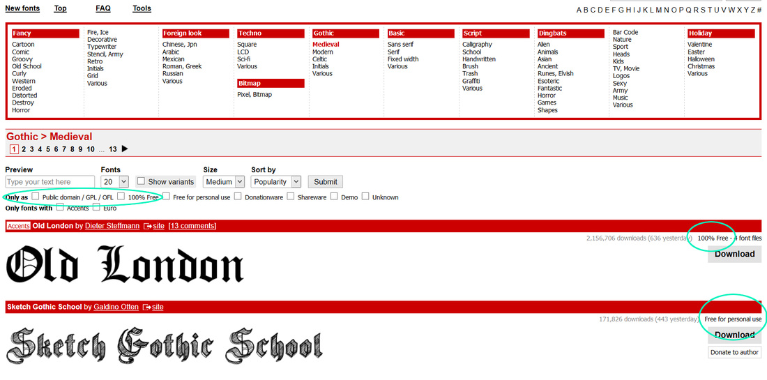
I've seen it done before. In fact, when I first started designing, I did it as well without even knowing. Illegal font usage. Just because a site provides free downloads to fonts doesn't mean they're free to use commercially. In fact, a large majority of them are for personal use only. Be sure to check! The figure below is a screenshot from dafont.com, one of the more commonly used free font sites. Again, "free font site" does not mean the font is 100% no-strings-attached free. It simply means you don't have to pay to download. I've circled points of importance in a minty green. Dafont.com gives you the option to filter the types of fonts you view by their license (see below). They also show which fonts are literally 100% free to use (personal or commercial), and which are obviously not. Most "free" font sites provide this information one way or another. If you don't see it specifically stated anywhere, be safe. Automatically assume that all fonts have a separate commercial license regulation, and search for how to get commercial usage rights.
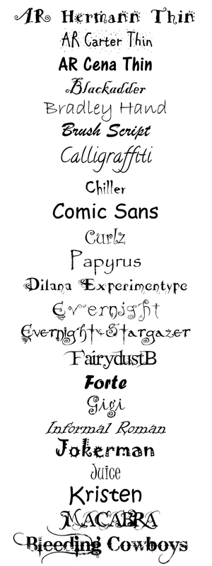
There are also some sites that ARE 100% free, both personal and commercial, such as fontsquirrel.com and Google Fonts. This is no different than someone pirating your ebook, authors. Please be respectful to the creators of the fonts that make your cover art shine! See all of those? Don't use them. Ever.
I'm gonna keep this pretty basic. Here are some covers that fall under either "erotica" or "erotic romance". There are ALWAYS some similarities in design concepts between these two genres. Can you find them?  A tutor that desperately wants to teach and a student that eagerly wants to learn. Off into the shadows she follows... After 2 years of running from her brutal past, Kiera Fox is now ready to start her life over. When she decides to finish her degree at the Essex University, the last thing she was expecting was to meet the handsome and intimidating Taylor Holloway. A brief encounter in the court yard ignites a searing desire inside of Kiera which she longs to act upon. When she takes that plunge she is surprised to learn that Taylor is her Art tutor. Giving in to the overwhelming longing for one another, Kiera embarks on a dark journey of submission to Taylor, guiding her into a world beyond just sex. He teachers her about dominance and submission, control and discipline, pain and pleasure, but this path is a little too familiar for Kiera. Bringing up too many raw memories she’s isn’t quite ready to face, but she can no longer run as her past has now found her. Whilst struggling to come to terms with her past, a new threat is boiling in the background. Dragging up old war wounds and dangerous secrets, Kiera soon learns she isn’t the only one hiding secrets. Although the threats warn about revealing the affair, Kiera feels it’s not just about exposing them, this is personal. Can their relationship remain in the shadows along with their secrets? And how far will Taylor push Kiera in surrendering her will to his dark world, without breaking her? 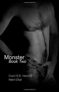 A Parliament of Twilight Yaoi novel Book Two of the Monster series picks up where book one left off, bringing us back into the budding relationship between the undead Chip and his captive J, and the reunion gone badly of Julian and Siris. Now that they are together, Julian and Siris have to face the consequences of their choices. They are presented an opportunity to leave their service as Agents by the enigmatic vampire Malachite. Will they take it? Is it really their only way out from under the influence of the Parliament of Twilight? And what happens when only one of the men is willing to consider the option? Chip has J at his mercy. He has Richard locked up safely for later use. But what can the inexperienced Zombie Master do to the jaded and over-sexed Agent? Will he be able to turn him to his side and have the friend and lover he has been craving? Or will J unleash his hidden nature and destroy Chip? And what about Richard? What's going to happen to this Agent caught in the crossfire? WARNING: The books in the Parliament of Twilight series are intended for mature readers with enough sense to know the difference between erotic fantasy and reality. There are some scenes of violence, gore, and/or horror movie like creepiness that not all readers will appreciate. FAIR WARNING ABOUT THE "Parliament of Twilight" BOOKS: There are triggering scenes of bondage with no safe words, near death and actual death, villains who are somewhat humanized as the series goes on, gray areas of right and wrong, brutally vivid recounting of horribly gruesome things, and other bits that not everyone will like. Please remember as you read that this is erotic HORROR before it is a love story as well as an ongoing series. Until the final book, we cannot promise you a HEA or even a happy for now ending, because it is not yet over.  ** Felicity has never met someone like Alex before. Alex literally glows from their lovemaking. For the first time, Felicity is in love, but the woman she's spent the last two months with may not actually be a woman at all. Felicity knows that Alex is something more, but she doesn't know exactly what. Allowing Alex into her life might be the worst mistake she's ever made. **  Devlin Fitzpatrick is a man of few words. Usually. An expert in surveillance and security, and a Dominant at Devoured, Devlin is known for his authoritative ways. After making the decision to observe rather than participate, and hiding from feelings and desires only few know about, Devlin throws himself into his work, and away from the practice of the lifestyle - that is, until he meets Ally. A chance encounter sets a new fire burning inside of Devlin - one that, up until then, has been absent. But, just as their relationship flares, a face from Devlin’s past returns, re-igniting long-subdued desires. Ally O’Conner was not looking for a man - especially one like Devlin. Yet, the mysterious, gorgeous, and dominant stranger becomes the one person Ally didn’t know she was seeking. As Devlin opens Ally’s world up to hidden emotions and uncharted desires, Ally quickly finds herself falling, even though she knows Devlin is hiding something from her: desires or needs she is unsure of. When a stranger calls, looking for Devlin’s help, Ally begins to fear the worst as he begins to pull away. Aiden MacCarrick has spent the last few years bouncing from place to place - drumming up work wherever he can. After a job gone wrong, Aiden finds himself on the wrong side of the bullet. With no other choice, Aiden reaches out to the one person he knows can help him. As Devlin works to clear Aiden of a misunderstanding, and save his life in the process, the three of them are entwined in a foreign world of deep desires, unbidden wants and uncharted feelings. Can they find a happy resolution to their desperate situation, or will their emotions dominate them? 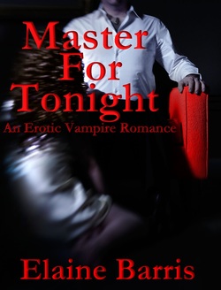 ***This book is intended for an audience 18 years or older*** While feeding in the slums of the city, he is interrupted by a woman. Mesmerized, he extracts his fangs from his meal and follows her home. Instantly obsessed, he watches her nightly. Nights turn to months. His desire for her becomes overwhelming. Though fearing the wrath of a vicious Maker who turned him against his will, Julian decides to give Kate the most sensual night of her life, and then walk away. Kate Collins is an average woman in her late-30’s, plagued by panic attacks. Sent home by her boss at the shelter, she prepares to have a night of relaxation…until her doorbell rings. Julian Montfort is the most beautiful and masculine man she has ever seen. He exudes ‘maleness’ from his entire body—that certain quality some men have in their DNA that makes a woman recognize her femininity…her ‘womanness.’ That part of her that is soft, malleable, and made to accept him. Drawn to him despite his unconventional arrival, Kate must answer his question: “Can you allow yourself this indulgence? It’s just one night.” Deeply sensual, Master for Tonight is a contemporary vampire romance which goes beyond the burning physical attraction between Julian and Kate, telling a tale of two people drawn together under incomprehensible circumstances, and their fight to be together against all odds. 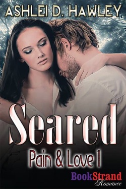 He comes to our world to free the soul of his eternal mate from her human existence but she doesn't want his help…or his love. Disillusioned by a marriage that ended tragically, suspicious and antisocial Reyna Sommer is not pleased to find herself stuck in a strange situation with a man who died and mystically revived in her woods. Worse, because of her association with him, she is now being hunted by a group that targets unnatural beings for destruction. Tyler Rhodes knows the best chance he and Reyna have to survive the Hunters depends on them being together, but he must first convince her to trust him. Can a man who traversed a galaxy for the woman he's loved for centuries finish his journey the way he hopes: with his mate safe and finally able to be with him forever? Most commonalities include (but are not limited to): sex appeal, dark colors, smooth lines, RED OR PINK colors, sexual innuendo, the actual phrases "erotic romance" or "erotic novel" or "erotica", easy to read fonts or scripted fonts. All covers have been used only with the permission of the authors.
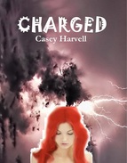
Look at the five book covers above. Without studying them too much, which ones really jump out and snag your attention? Which ones are easy to pass over without a second thought? Of course, this entire subject can be debated based purely on personal preference, but one thing is a resounding common factor. It is human nature to judge a book by its cover. According to Wikipedia, the English idiom "don't judge a book by its cover" is a metaphorical phrase which means "you shouldn't prejudge the worth or value of something by its outward appearance alone". (1) Unfortunately, it has become human nature to judge EVERYTHING by the outward appearance, the first impression. 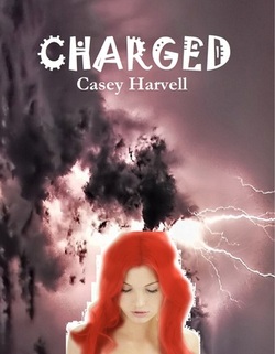 For example, the original cover of Charged by Casey Harvell was...well...made by the author due to lack of funds. Casey (bless her heart) volunteered this cover because she knew it wasn't up to par. Sometimes, authors do what they have to do in order to get their story out. Luckily, Casey was able to get some reviews of her story purely based on the story alone!
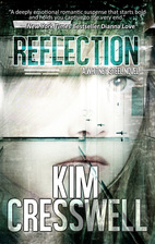
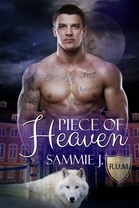
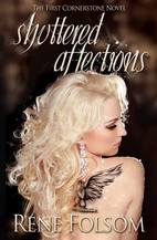
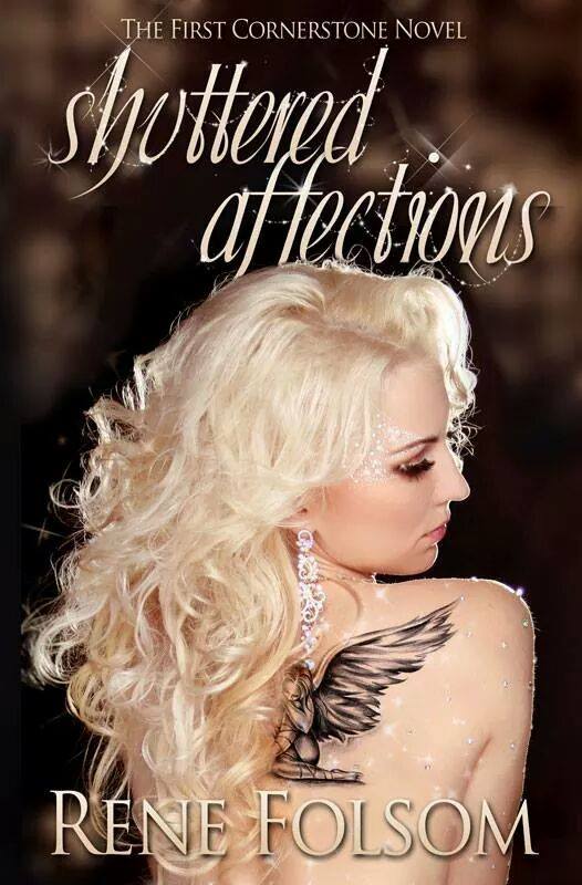
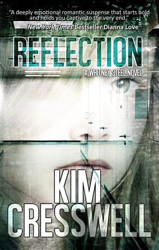
 Casey has since managed to upgrade her cover. I don't know if she's received new reviews since the change, but I believe she'll get more response with this new one. 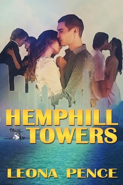 Let's look at Hemphill Towers. Leona graciously volunteered her cover as well. I don't know who originally designed it, but I do believe they were meant to be in a professional opinion to do so. At first glance, Leona's cover isn't all that bad. The font is placed nicely and the typography is a solid fit for the design. In fact, the bottom half of the cover is great! However, the top half, the half with the three couples, is poorly constructed. Not only are all three couples muddled and degraded in terms of quality, but the crop job around them is choppy, amateur, and not even well blended. It's very possible that most common viewers wouldn't notice these things, but more often than not people are MORE critical versus the contrast (less). Nonetheless, Leona was also fortunate to receive some colorful raves. These three covers are structurally sound, and extremely appealing to the eye. The first two use sex appeal to attract the viewer, which is one of the most common techniques society has trained us with. The third uses mystery and color to pique interest. (Thank you to Rene, Sammie J., and Kim for volunteering your covers.) As a graphic designer, I notice so many issues in designs used. It's my job as an artist. However, as a READER and a fan, I know that there are so many books out there that have covers that just don't do the story justice. If we were not such visual creatures, this wouldn't be such a big deal, but it tends to become detrimental to those authors who put so much of their time and effort into their stories. If there was a way to advertise a story for its interior rather than its exterior, I wish we would all focus more on that. I have a challenge for you. Once a month, seek out a cover that falls short and purchase the book. Give it a shot. You may be surprised! (1) The New Dictionary of Cultural Literacy, 3rd ed. 2002
All images are linked to their Amazon purchase link (except the very first row of images). Please feel free to click them to view larger images, read blurbs, and purchase books. The process of creating a book cover. This was the recommendation for my first post. I really have no idea where to start, so I guess I'll wing it! Like any graphic creation, book designing can be extremely simple to overly complex. It really depends on the type of image(s) being used and the style of the design. Sometimes, a book cover is simply a pretty image with text over the top. Other times, it's a combination of several images intricately layered together, blended with brushes and filters, sometimes all the way down to each individual pixel. Now, if you don't know much about image resolution, pixels may not make much sense to you. If you don't know much about programs like Photoshop or GIMP, terms like "brushes" or "filters" may be over your head. Just know that these are all things that I have to know about in order to make a cover work. One of the most difficult parts of being a graphic designer is creating a cover that fulfills the author's fantasy. Many times, I run into a situation where an author has a very specific design idea in their head and they simply do not want to sway from it. Unfortunately, I am not a photographer and don't have the option of just going and taking my own pictures of models in the exact poses these authors want. Because I don't have this option, I'm stuck with stock images as my selection. Though there are several stock image sites, most of them share the same images. Yes, I still have a pretty wide selection to choose from, but some poses are just non existent. OR they're overused. I do my very best to create what the author is looking for, but dealing with someone who's not willing to have a little flexibility can make my job frustrating. (HINT TO AUTHORS: Please try to keep your options open!) Other roadblocks that are often encountered: the perfect stock image is cropped the wrong way, lighting effects between images are too drastic to blend, trying to blend a non-filtered image with one that already has a filter applied. Though these things may not initially make sense to the author, I do my best to explain it in terms everyone can understand. Sometimes I fail miserably at this. The #1 issue that most people struggle with (including myself) is typography. Typography can literally make or break a cover. You can have the most beautiful design and have a tacky font slapped on top, and it'll destroy the entire thing. Even the best of the best struggle with this. Other common issues: choosing a design that is too complex or too busy, title/author placement, contrasting colors vs. complimentary colors, lack of color vs. too much color ANOTHER NOTE TO AUTHORS: Sometimes, simple IS better! Anyone who knows me can tell you this tends to be a resounding motto of mine. Believe it or not, too much on a cover can drive a potential buyer off. The human mind is built to compute LESS, not more. So, if you only have one or two things going on, they're more likely to stop and really look at it. Too much can actually cause strain on the eyes. One other thing I'm constantly doing: research. As a paranormal enthusiast, my personal favorite to design is anything paranormal/fantasy/scifi. Because of this, there are a lot of genres I'm not overly familiar with when it comes to popular design esthetic. And yes, each genre has a fairly common esthetic. So, I research. I look up popular books in a specific genre, check around to see what fonts (typography) are most commonly used for said genre, and color concepts. I'm constantly breaking other book covers down into segments, trying to see where the layers are, etc. It ends up being a very complex adventure. I have no idea if I covered enough or not, but these are a good number of things I look for while designing. Questions? Please ask! Other topics you want to read about? Keep them graphically related, and I'll see what I can do!
|
Rachel A Olson
Single mother of one, published author, southpaw, paranormal enthusiast, nerd/dork/geek/unicorn. Archives
April 2017
Categories
All
|





 RSS Feed

